Table of Contents
Chart / Status ItemTable ItemDatasource Settings (Item Options)Item TypesChart TypesData source (Item Data)Ignored StatsActive Radio StatsGrouped BySetting Item Time FramesTime Slice SizeFilter by SettingsThere are three types of chart items that can be added to a tab, they are:
- a Chart Item.
- a Status Item; and
- a Table Item.
They are all added via the Add Chart icon, which looks like a plus sign, in the bottom right of a dashboard tab. You can add a chart to an existing tab, or you can add a new dashboard tab by clicking the New Tab link in the top right of the Dashboard.
Chart / Status Item

Table Item

Datasource Settings (Item Options)
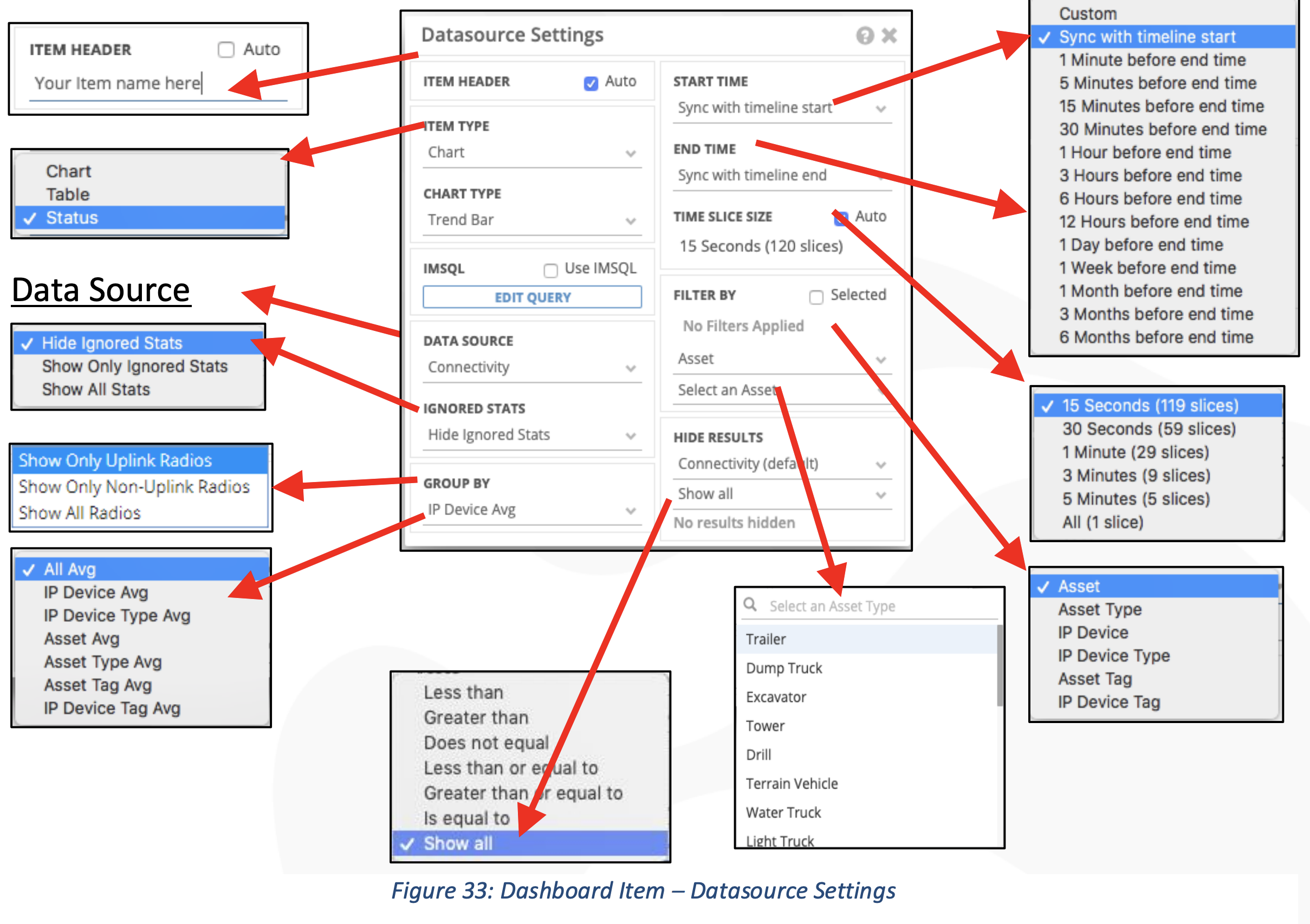
Item Types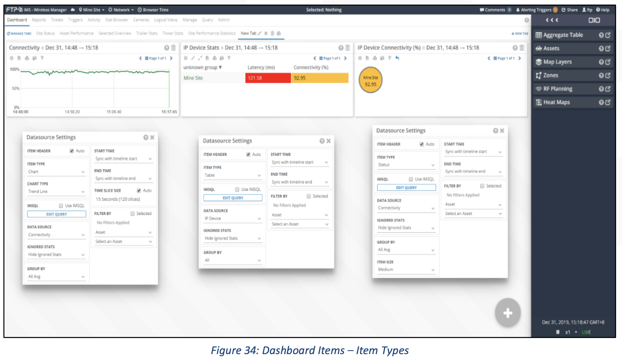
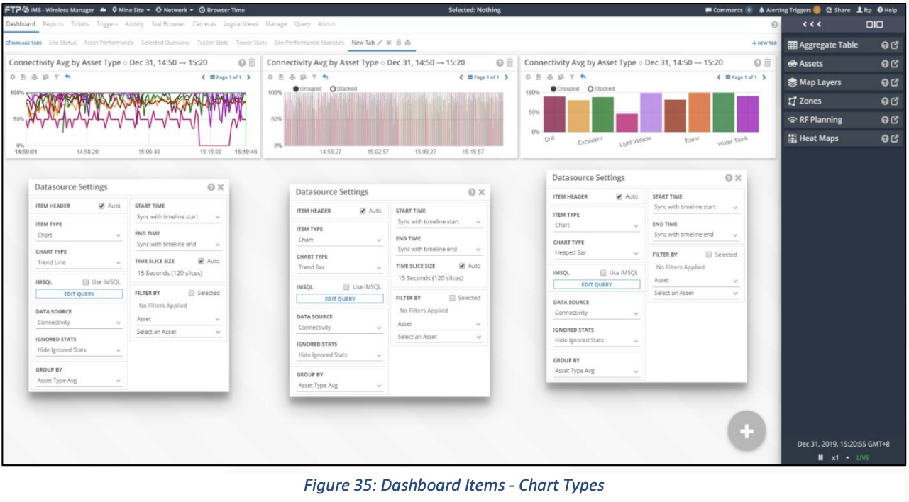
Chart Types
Data source (Item Data)
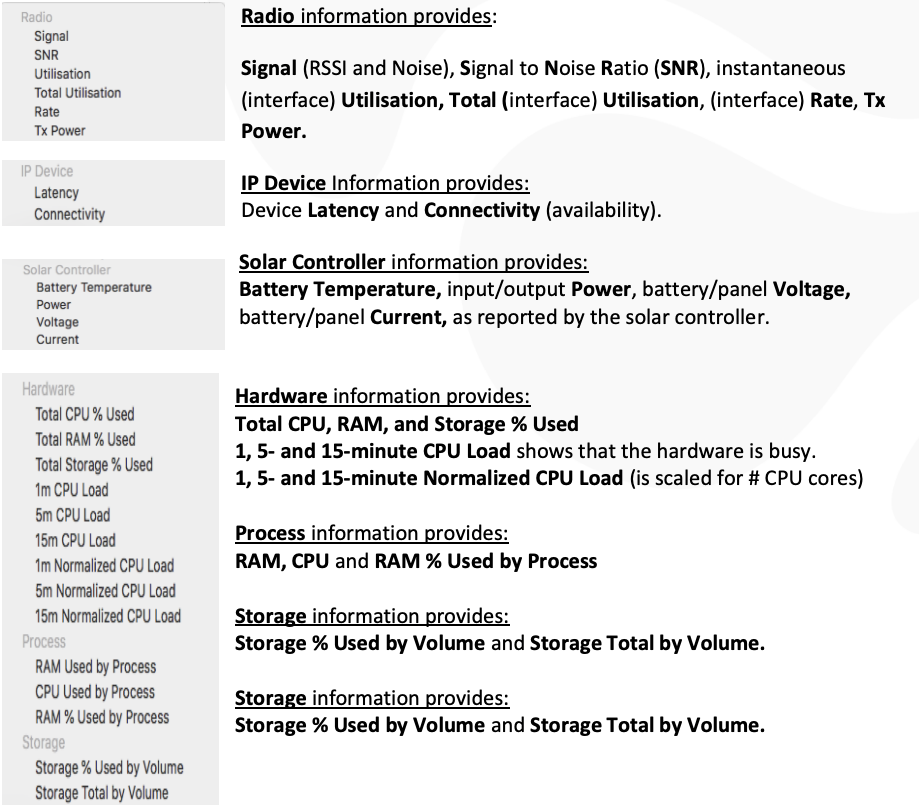
Ignored Stats
The settings found under Ignored Stats allow the user to choose between including or excluding any IP Devices or Assets that are currently ignored. This could be useful when wanting to include the entire fleet in an availability chart, even those Assets with known problems, and problems that for any particular reason have caused the device to be set to be ignored.
Active Radio Stats
The settings found under Active Radio Stats are shown when the data source is a radio stat and allows the user to choose to filter only uplink radios, non-uplink radios or all radios.
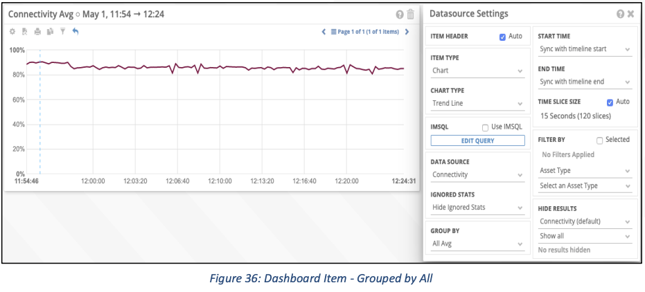
Grouped By
Grouped By changes the way the data is grouped on the X Axis. For example, if you were creating a chart that showed the Availability of Dump Trucks, then there would be, potentially, three different ways to group the data. You could represent the Availability of all dump trucks using the Group By of All Avg. Which would produce:
We could then Group By Asset Avg, which is quite busy: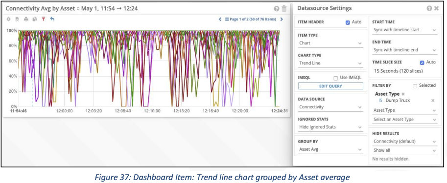
We could then change the chart type to be a heaped bar, such as the following:
Or Status Items, such as the following: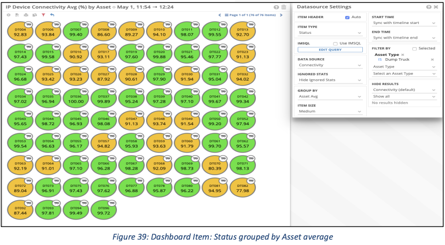
Setting Item Time Frames
The default Start Time and End Time are synced with the data loaded into the map view. This means that as you jump forward and backward in time, the Item data will automatically represent your current timeframe. You can extend out the Start Time, or the End Time to give a larger period of time to report on. If we think of the timeline in IMS as a bracket, that in Live Mode, the bracket is always shifting to the right, to keep up with current time. New data comes in from the right and exits out of the bracket to the left. If you were to then specify a start and end time for the bracket then the Start (Start Time) would be on the left of the bracket and would be the oldest data, the End (End Time) would be on the right of the bracket and would be the newest data.
So, the Start Time represents the farthest data point back in time and the End Time represents the newest data point, which could be right now, if you leave the Start and End Time settings to be default, or back in time, if you change the settings. If you wanted a chart representing the last week of data, you would leave the End Time Sync’d with the timeline’s end and change the Start Time to be ‘one week before end time’ or any other desired setting.
Time Slice Size
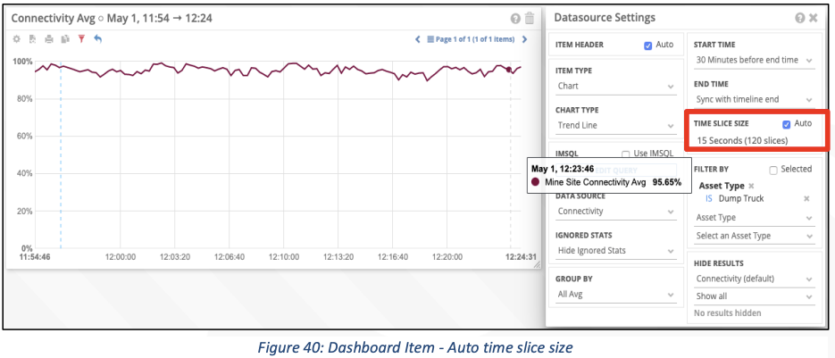
It is possible to have more data points along the x-axis. By default, the Time Slice Size is set to auto. By deselecting auto, you can choose other values to give the Chart Item a higher frequency or lower frequency of sample points. For example, a 30-minutes chart using auto settings, which default to the most granular, 15 second slices of data:
By overriding Auto, you can select other Time Slice Size, 3 minutes in this case: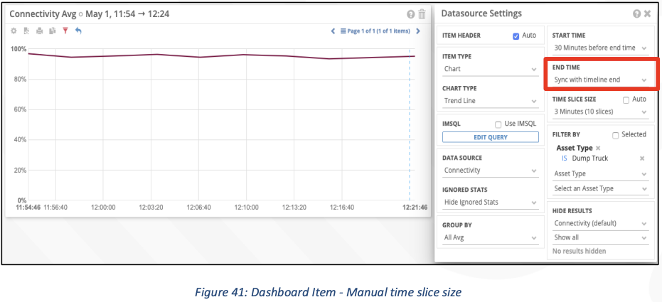
Filter by Settings
To refine and filter the data going into the chart it is possible to use the Filter By option. This gives the user to select individual Assets or IP Devices or groups of them; also, classes of Asset, Excavators or Dump Trucks for example. You can also filter by Tag or IP Device type.
For example, I want to see how the different classes of SMEs compare for network availability:
Show me how the AHS trucks compare to the Manned Fleet: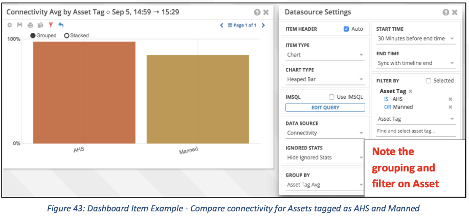
Show me which SMEs are tagged with AHS: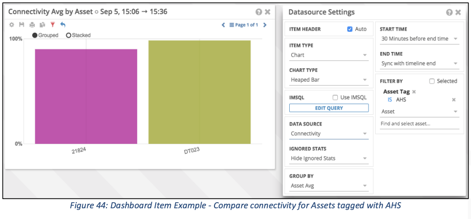
I thought there were 3 AHS trucks, but I only see 2? Try including Ignored Stats (show all stats)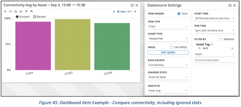
On those 3 trucks, compare the Wi-Fi radio types: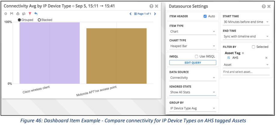
How do I get exact values for those bars? Mouse over or change to a table, such as the following: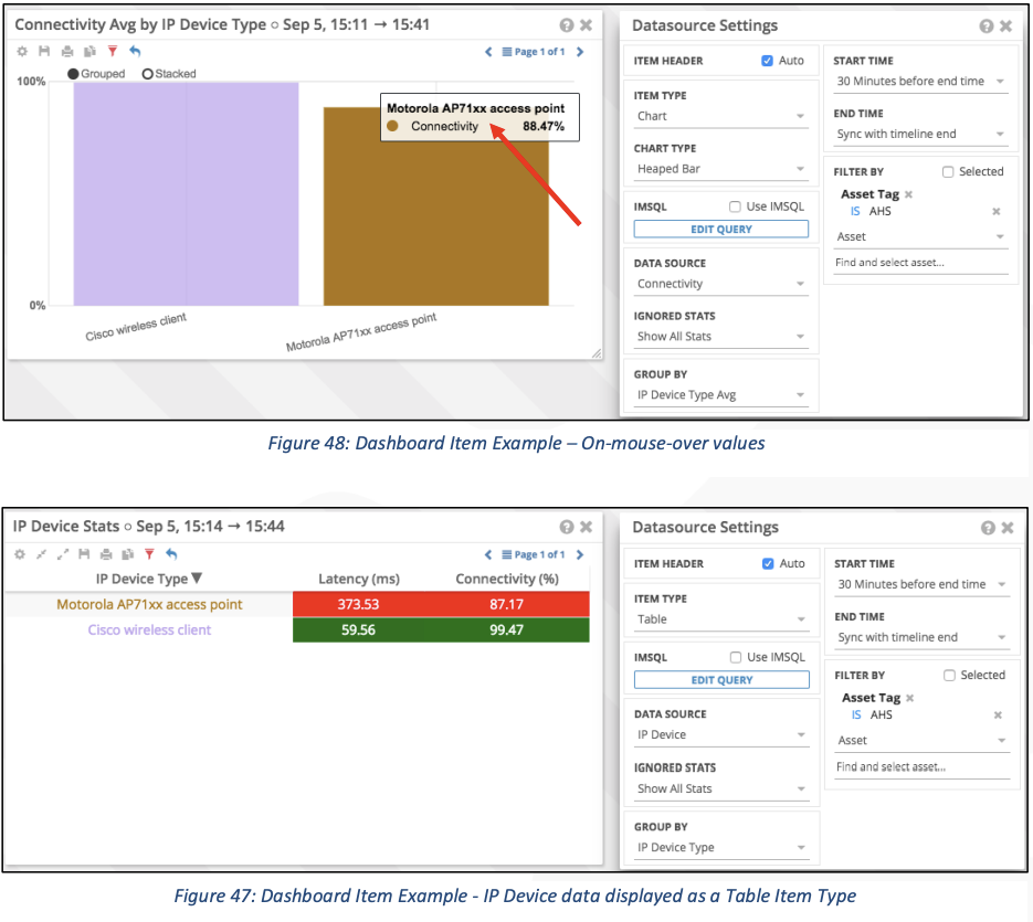
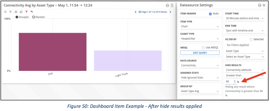
How do I filter out values that I do not want to appear on my chart?
Before hiding: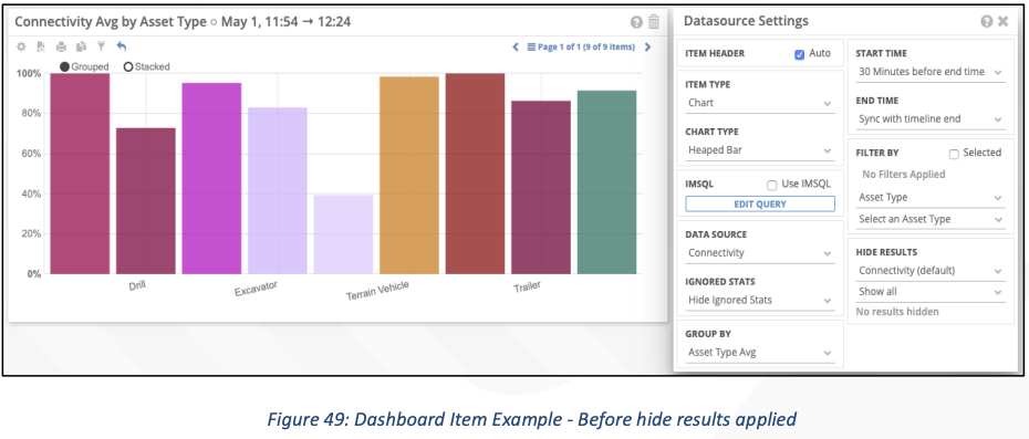
After hiding: